🌱
Modern CSS grid solutions to common layout problems
Dynamic centered layout
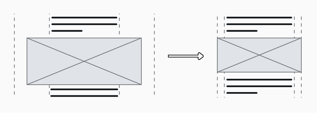
article {
  display: grid;
  grid-template-columns:
    minmax(2rem, 1fr)
    minmax(auto, 65ch)
    minmax(2rem, 1fr);
}

/* Center all children */
article > * {
  grid-column: 2;
}

/* Wider & centered images */
article > img {
  grid-column: 1 / 4;
  justify-self: center;
  width: 100%;
  max-width: 100ch;
}
Responsive multi-column grid system
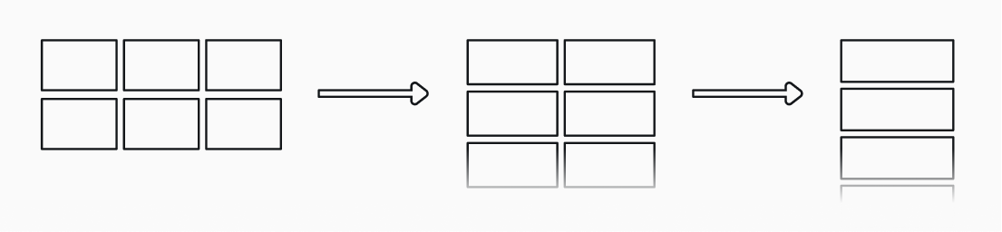
.grid {
  display: grid;
  grid-template-columns: repeat(auto-fit, minmax(20rem, 1fr));
  width: 100%;
}
Two-way card layouts
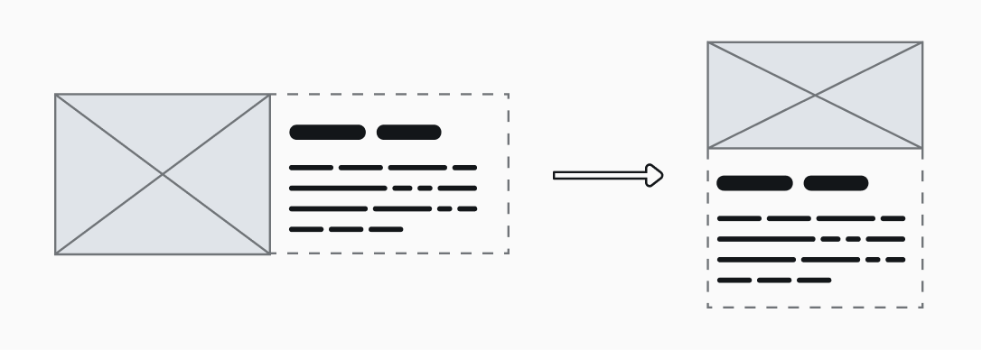
.grid {
    display: grid;
    grid-template-columns: repeat(auto-fit, minmax(20rem, 1fr));
    grid-template-rows: auto 1fr;
    width: 100%;
}